Beyond 1x: Automating @2x/@3x PNG Exports from a Single SVG Source
 iSVGtoPNG Team
In modern web and application development, the mantra is "work smarter, not harder." Yet, I still see teams trapped in a tedious, time-consuming cycle: manually exporting the same icon or graphic three, four, or even five times from a source file to satisfy the ever-growing demand for different screen resolutions. The folders are a mess of icon.png, [email protected], and [email protected]. This workflow isn't just inefficient; it's a relic of a bygone era.
Over my decade of experience building, calibrating, and evaluating digital displays, I've witnessed the pixel density revolution firsthand. The jump from standard to high-DPI (or "Retina") screens was a paradigm shift. Today, serving a single 1x raster image is a sign of an unpolished, unprofessional product. The solution? A "single source of truth" workflow, with the infinitely scalable SVG at its core. This guide will walk you through exactly how to automate your @2x and @3x PNG exports from a single SVG, saving you countless hours and ensuring every pixel is perfectly crisp, every time.
Why You Need @2x & @3x Assets: The High-DPI Revolution
Before we dive into the "how," it's crucial to understand the "why." Why is a 1x PNG no longer sufficient? The answer lies in the hardware your users are holding and the screens they are sitting in front of.
A Crash Course in Pixel Density (PPI)
Traditional displays had a pixel density of around 72-96 Pixels Per Inch (PPI). On these screens, one CSS pixel corresponded directly to one physical hardware pixel (a 1:1 relationship).
High-DPI displays, like Apple's Retina screens, changed the game. They pack two, three, or even more physical pixels into the same space. A device might have a device-pixel-ratio of 2, meaning one CSS pixel is now backed by a 2x2 grid of four physical pixels. This is what allows for such incredibly sharp text and graphics.
My first encounter with a Retina MacBook Pro in 2012 was a professional turning point. The clarity was breathtaking, but it also immediately exposed the flaws in our existing web assets. A 100x100 pixel logo (a 1x asset) displayed on a 2x screen was being stretched to fill a 200x200 physical pixel space, resulting in a blurry mess. To maintain a professional standard, we had to provide images with more pixel data—the @2x and @3x assets.
Failing to provide these higher-density assets results in a subpar user experience. Your beautiful vector designs become fuzzy approximations. This lack of polish can erode trust and make an application feel cheap, sometimes even leading to blurry edges or anti-aliasing nightmares.
The Foundation: Using SVG as Your Single Source of Truth
If we need multiple sizes of PNGs, why not just design them at the largest size? While better than scaling up, it's still an inefficient workflow. The true professional solution is to use a vector format as your single, canonical source. In web development, the undisputed king of vector formats is SVG (Scalable Vector Graphics).
Unlike raster formats (PNG, JPG), SVGs are XML-based text files that describe shapes mathematically. This gives them superpowers:
- Infinite Scalability: Scale an SVG to any size, and it will never lose quality.
- Small File Size: A simple SVG icon can be just a few hundred bytes, far smaller than a PNG.
- Editable & Animatable: Because SVGs are code, you can manipulate them with JavaScript and style them with CSS.
Before you begin, it's a best practice to ensure your source SVG is clean. Running your source file through an SVG optimizer first will ensure your starting point is as lean and efficient as possible.
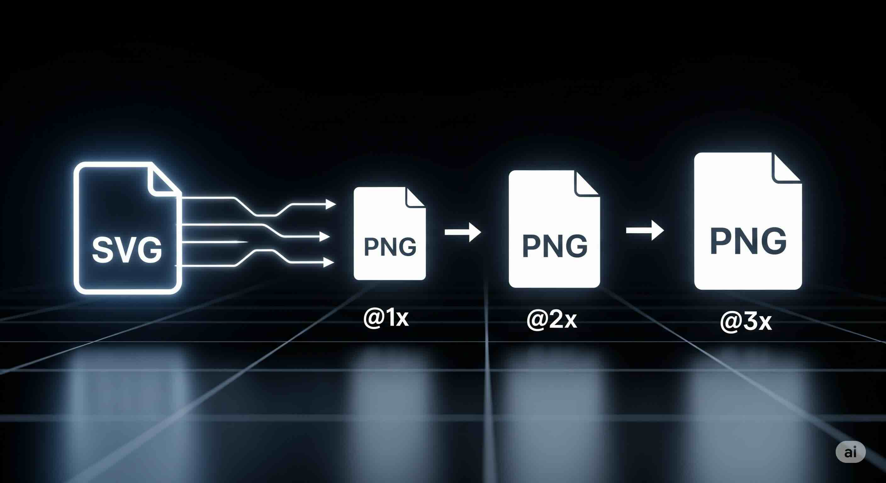
How to Automate Your @2x/@3x PNG Export Workflow
Now for the main event. How do we turn our optimized SVG into a pristine set of @1x, @2x, and @3x PNGs without losing our minds? Here are three popular methods, from simple to fully integrated.
| Method | Best For | Pros | Cons |
|---|---|---|---|
| 1. Online Tools | Small projects, one-off tasks | No installation, easy to use | Manual process, less scalable |
| 2. Build Scripts (Node.js) | Professional teams, large projects | Fully automated, reproducible, powerful | Requires setup and coding knowledge |
| 3. Design Tool Exports | Bridging design & development | Integrated into design software | Often a manual step, not server-side |
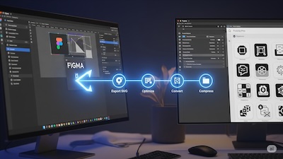
Method 1: The Smart Manual Approach with Online Tools
The fastest way to get started is to use a high-quality online tool. A simple SVG to PNG converter with a resolution multiplier is a good start. For multiple icons, a dedicated SVG Batch Converter is indispensable. It allows you to drag and drop an entire folder of SVGs, configure your export settings once (e.g., "I want PNGs at 1x, 2x, and 3x"), and process the entire set in one go.
Workflow:
- Gather all your final SVG source files in a single folder.
- (Optional) Check complex SVGs in an SVG Viewer to ensure they render as expected.
- Upload the folder to a batch converter.
- Set your desired output formats and resolution multipliers.
- Run the conversion and download a ZIP file with all your assets.
Method 2: The Developer's Workflow with Build Scripts
For larger projects, integrating asset generation into your project's build process is the ultimate goal. This is typically done with Node.js and a powerful image processing library like `sharp`.
// generate-assets.js
const sharp = require('sharp');
const fs = require('fs').promises;
const path = require('path');

const SOURCE_DIR = path.join(__dirname, 'src', 'icons');
const OUTPUT_DIR = path.join(__dirname, 'dist', 'images');
const SIZES = [
  { name: '', scale: 1, baseSize: 32 },   // for @1x
  { name: '@2x', scale: 2, baseSize: 32 }, // for @2x
  { name: '@3x', scale: 3, baseSize: 32 }, // for @3x
];

async function processIcons() {
  try {
    await fs.mkdir(OUTPUT_DIR, { recursive: true });
    const files = await fs.readdir(SOURCE_DIR);
    const svgFiles = files.filter(file => path.extname(file).toLowerCase() === '.svg');
    console.log(`Found ${svgFiles.length} SVG icons to process.`);

    for (const svgFile of svgFiles) {
      const baseName = path.basename(svgFile, '.svg');
      const inputPath = path.join(SOURCE_DIR, svgFile);

      for (const size of SIZES) {
        const outputName = `${baseName}${size.name}.png`;
        const outputPath = path.join(OUTPUT_DIR, outputName);
        const targetWidth = size.baseSize * size.scale;

        console.log(`  -> Generating ${outputName} (${targetWidth}px)`);

        await sharp(inputPath, { density: 96 * size.scale }) // Increase density for sharpness
          .resize(targetWidth)
          .png({ quality: 90 })
          .toFile(outputPath);
      }
    }
    console.log('Asset generation complete!');
  } catch (error) {
    console.error('An error occurred during asset generation:', error);
  }
}

processIcons();
To use this, you would install the dependencies (`npm install sharp`) and then run the script from your terminal (`node generate-assets.js`).
Method 3: Integration with Modern Design Tools
Modern design tools like Figma, Sketch, and Adobe XD have powerful export capabilities built-in, allowing designers to export assets with various suffixes and at multiple scales. This is an excellent option for bridging the gap between design and development but often remains a manual step.
The Final Step: Post-Conversion Optimization & Implementation
Generating the assets is only half the battle. To truly master this workflow, consider what happens next.
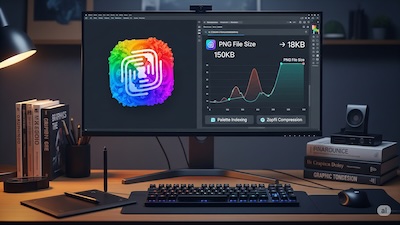
- Optimization: The final step in any professional asset pipeline should be to run all output images through a high-quality PNG Compressor. This can shave off an additional 30-70% from the file size, which is critical for web performance.
- Implementation: Use the
<img>tag with thesrcsetattribute to let the browser choose the most appropriate image based on the screen's pixel density.
<img src="/images/my-icon.png"
     srcset="/images/[email protected] 2x,
             /images/[email protected] 3x"
     alt="A descriptive alt text for my icon">
This code tells the browser which image to use for 1x, 2x, and 3x screens. It's the standard, most robust way to handle high-DPI images.
Conclusion: Embrace the Automation
The transition to high-DPI displays is complete. Manually managing multiple image resolutions is no longer a sustainable or professional practice. By embracing an SVG-first workflow, you establish a single source of truth that is scalable, maintainable, and future-proof.
Whether you choose the accessibility of online batch converters or the power of a custom Node.js script, the principle remains the same: automate the tedious work. This frees you up to focus on what truly matters—designing and building exceptional user experiences, confident that your visuals will look perfectly sharp and professional on every screen, every time.
iSVGtoPNG Team
iSVGtoPNG Team is a front-end developer and graphics enthusiast with over 10 years of experience in web technologies. She loves exploring the intersection of design and code.